Richard
What began with plans for a kitchen renovation grew into a much larger reimagining of this century-old Craftsman home in Dallas’ Conservation District. As we uncovered what the home needed, the opportunity became clear: restore the character that had been lost over time while thoughtfully reshaping the spaces around the way our clients live today.
Working within the home’s original architectural language, we reworked the floor plan and introduced details that feel as though they could have always belonged. Curves repeat in cabinetry, stone profiles, doorways, and millwork. Expressive natural stone, handmade tile, warm woods, aged brass, and collected details bring depth and movement, while a palette of deep greens, sultry browns, and quieter neutrals carries from one space to the next.
The goal was never to recreate the past. Instead, #RCIProjectRichard takes cues from it, layering old and new to create a home rooted in its history, deeply personal to our clients, and intentional in the way it lives.
Butler’s pantry
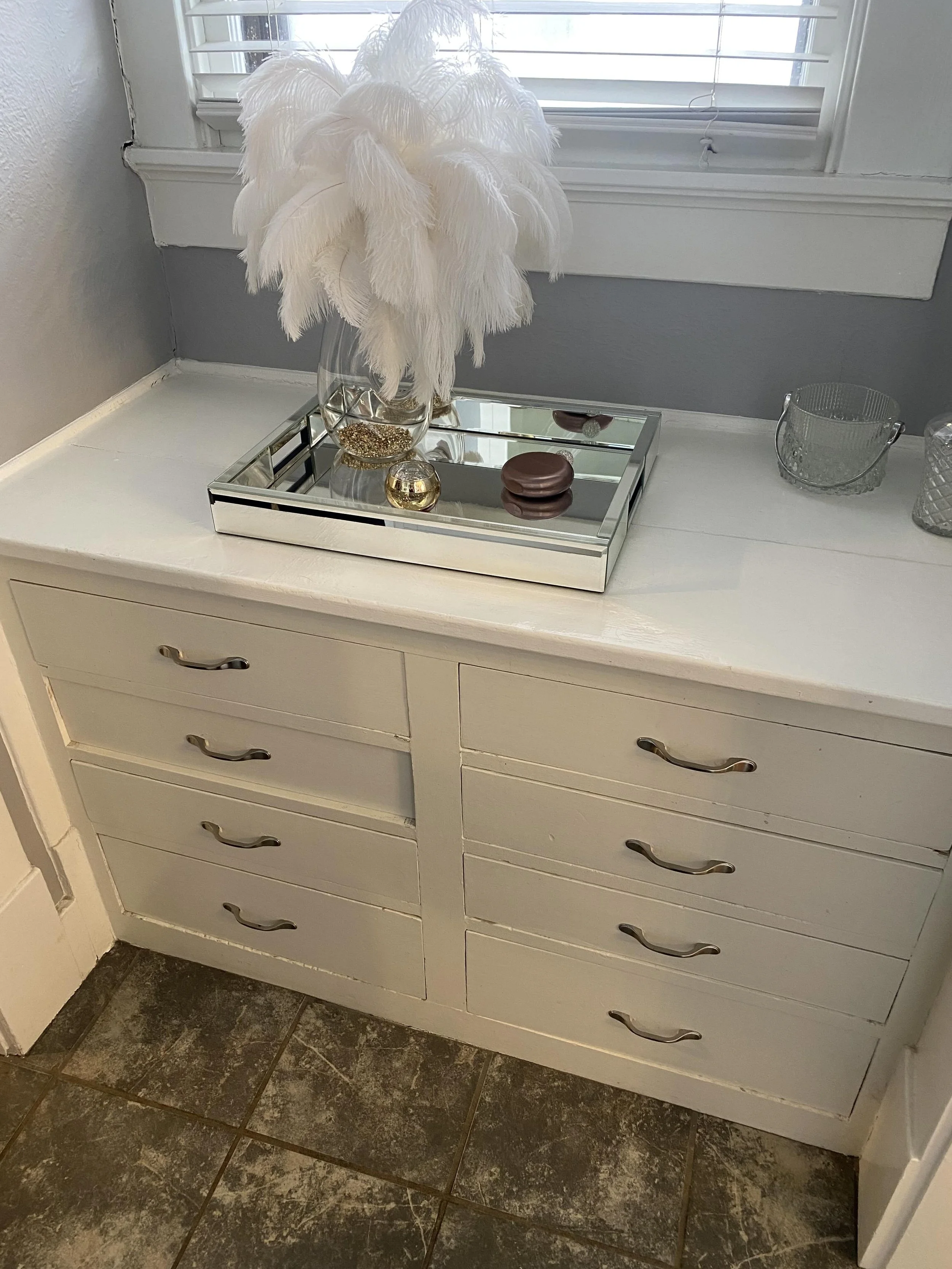
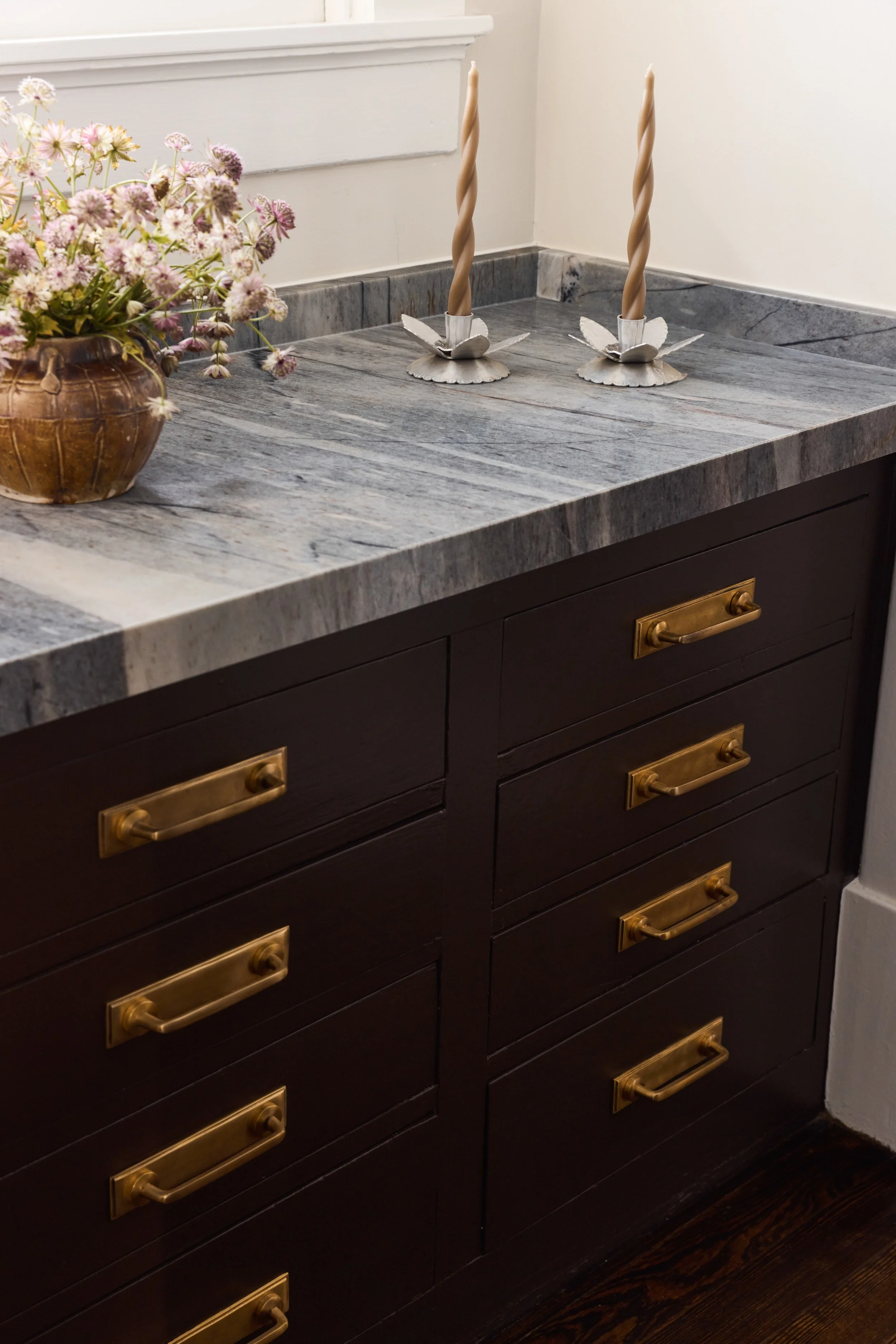
Before any of the finishes came into play, the work began beneath the house. Working closely with Starr Construction, the pier-and-beam foundation was addressed to create a sound starting point for the transformation ahead.
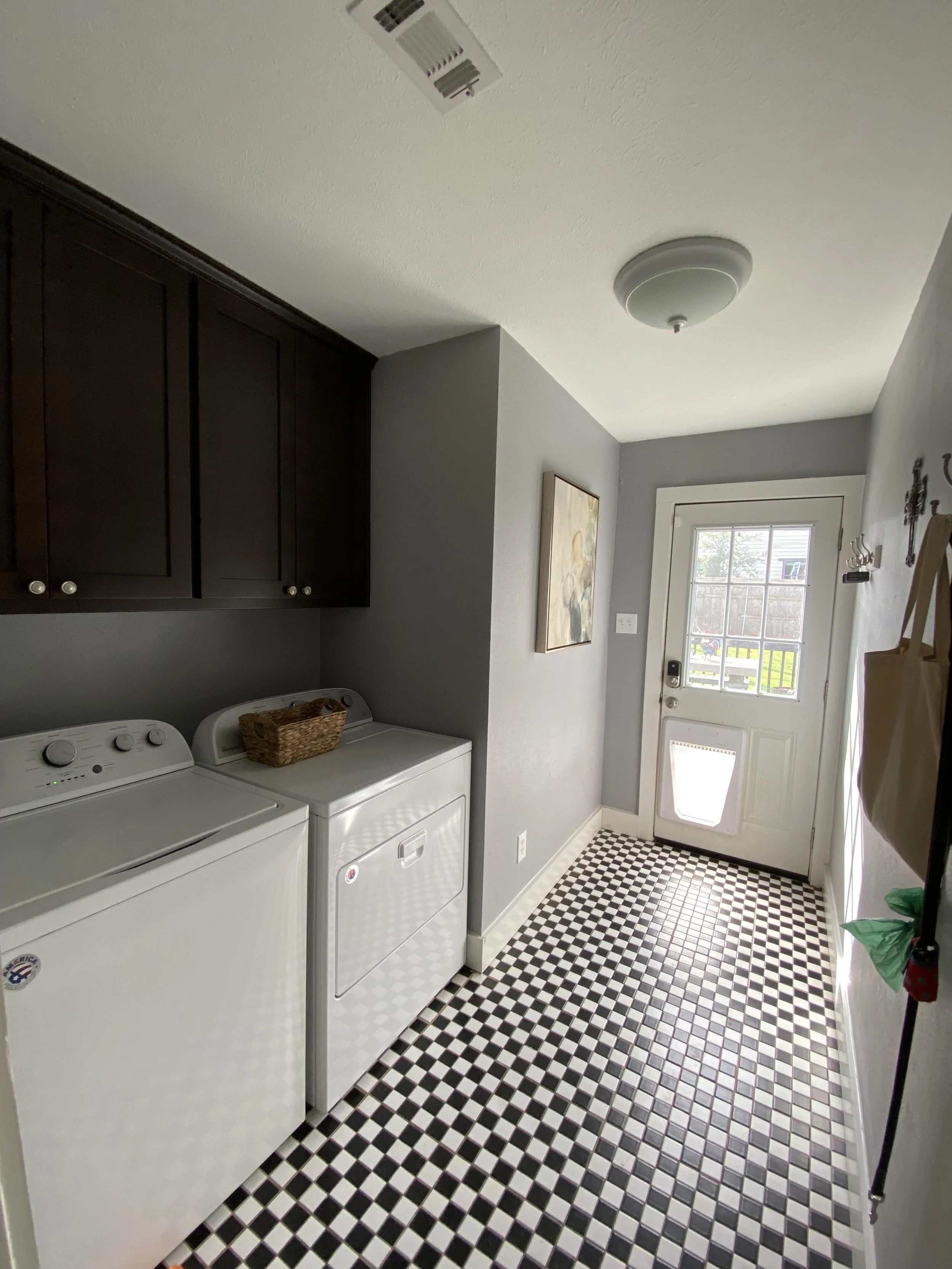
From there, one of our priorities was determining what deserved to stay. The original buffet built-ins were something our client had loved from the beginning, so rather than replace them, we gave them a new life. The cabinetry was sanded and refinished in Sherwin-Williams Cracked Pepper, transforming an existing detail into the foundation for the moody butler’s pantry.
Unlacquered brass hardware was selected throughout the space for the way it will naturally patina with time—a small detail that felt especially fitting in a century-old home. Instead of asking every new element to look old, we chose materials that would age alongside the house.
This room also began establishing a language that repeats throughout the project: rich color, expressive stone, natural materials, and a balance of strong lines with softer curves. Those details create continuity as you move from the darker, more intimate pantry into the lighter kitchen beyond.
Kitchen
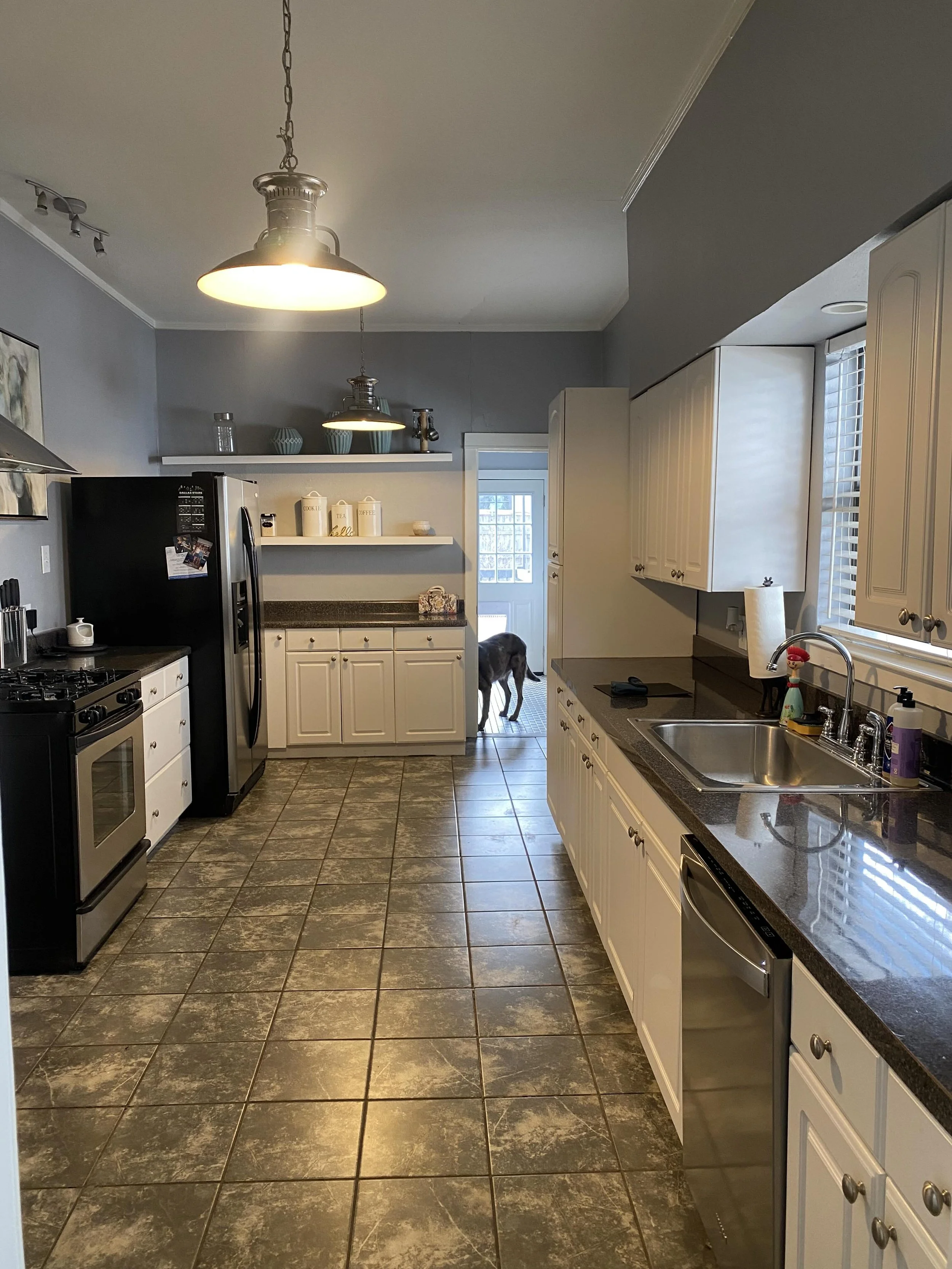
The original kitchen simply didn’t have the square footage needed to support the way our clients wanted to live, cook, and entertain. Rather than allowing the existing walls to dictate the design, we looked at the surrounding floor plan as a whole to find a better use of the home’s footprint.
A series of closets serving the primary bedroom occupied valuable space along the kitchen, so we reworked that portion of the floor plan, giving that square footage back to the kitchen while creating a new, dedicated primary closet elsewhere. The shift allowed us to substantially expand the kitchen and rethink how it functions without sacrificing the storage our clients needed.
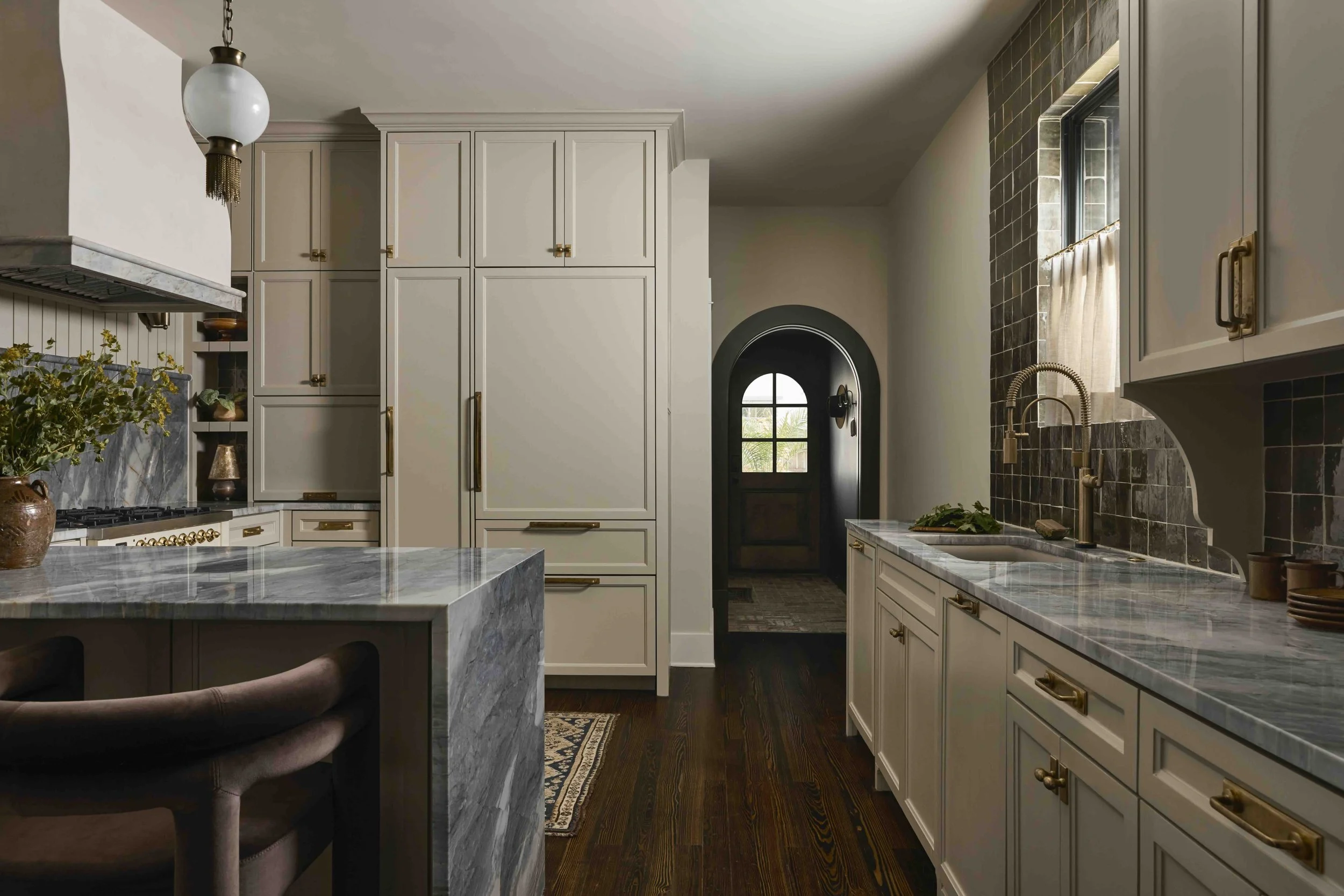
With the additional space, we were able to create a more intuitive layout with designated storage, a concealed coffee bar, deep pantry cabinetry, panel-ready refrigeration, and a generous peninsula designed for both everyday living and entertaining. Just as importantly, the expanded footprint gave the architectural details room to breathe.
Natural stone became one of the defining materials. The quartzite continues from the butler’s pantry into the kitchen, where its soft green and blue movement brings in our client’s favorite color without feeling overly literal. We worked closely with the fabricator on slab placement, allowing the movement of the stone to become part of the composition rather than simply a surface.
At the sink wall, mossy gray-green 4x4 Zellige tile stretches to the ceiling and wraps the newly centered kitchen window. Its handmade variation gives the wall an imperfect, tactile quality against the more tailored cabinetry. A café curtain softens the window and provides privacy without sacrificing natural light, while the repositioned sink creates a more intuitive connection between the range, refrigerator, and prep areas.
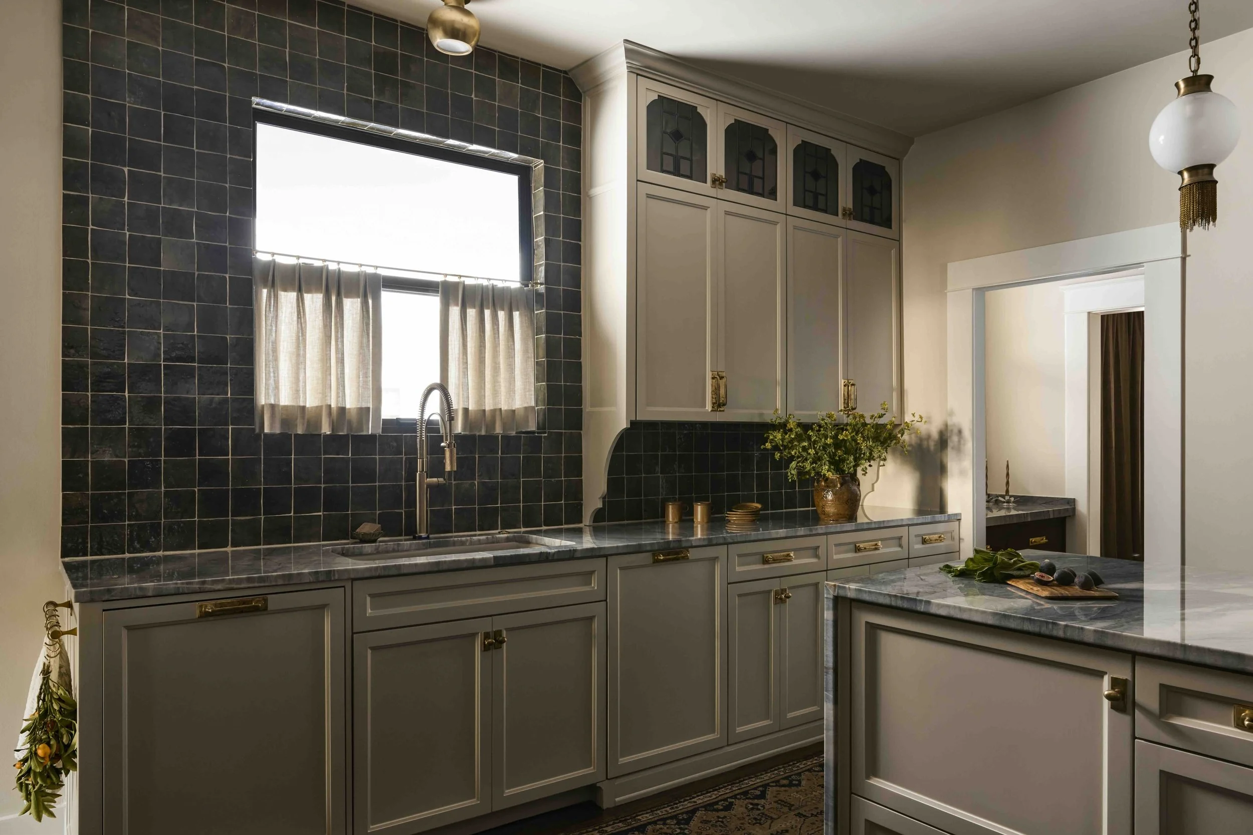

With the function resolved, the cabinetry became an opportunity to bring more of the home’s original character into the new kitchen. Custom curves at the base of the upper cabinets soften the long runs of millwork, while stained-glass cabinet fronts reference motifs found elsewhere in the home. Their warm terra-cotta tones bring another layer of color to the green tile and stone, giving the new cabinetry a sense of history without trying to replicate the past.
At the range, quartzite moves vertically to create a dramatic stone backsplash that can also withstand the demands of an everyday kitchen. A narrow stone ledge provides a practical resting place for oils, spices, and the things our clients reach for most. Above it, a custom lime-plaster hood with bullnose detailing brings softness and texture against the movement of the stone.
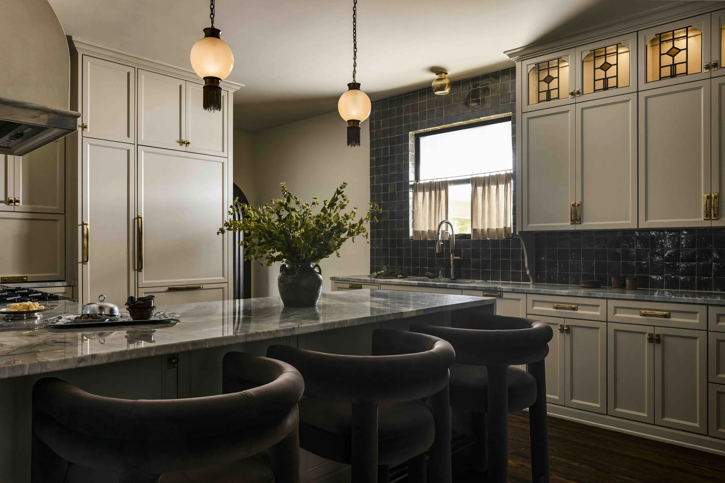
The peninsula was designed for entertaining with real life in mind. Three performance-velvet counter stools were customized to tuck comfortably beneath the counter, while the waterfall stone edge protects one of the kitchen’s busiest pathways. It also happens to be a favorite rubbing spot for the family dog, making that durability especially useful.
Below, the cabinetry conceals the microwave and ventilation, while a parlor-style footrail adds another subtle nod to the home’s collected character. Vintage pendants overhead bring a softer, slightly unexpected moment to the room.
At the far end of the kitchen, a custom arched door marks the transition into the bar and echoes the deeper tones of the butler’s pantry. Its glass panel keeps the spaces visually connected while framing the backyard and the Japanese maple just beyond it.
bar
The bar was actually the first space we designed for #RCIProjectRichard , and in many ways, it established the point of view for everything that followed.
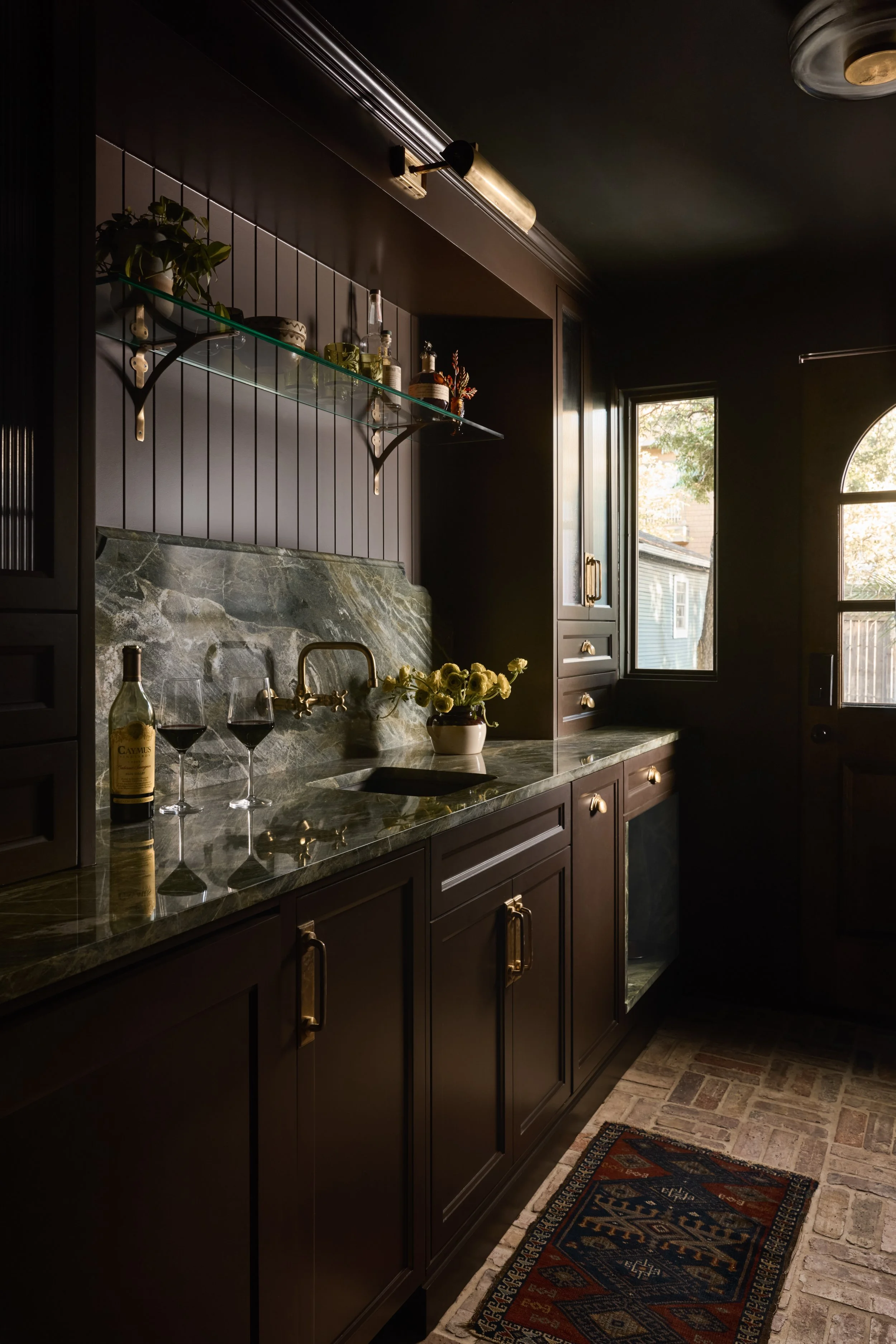
Here, we leaned fully into a moodier palette. Emerald Forest Quartzite wraps the countertop and backsplash, its dramatic green movement becoming the centerpiece of the room. Traditional curves along the stone edges soften the material and connect back to the shapes repeated throughout the home.
Deep cabinetry surrounds the stone, creating an intimate contrast to the lighter kitchen while giving the bar an identity of its own. Reeded glass breaks up the cabinetry and offers concealed storage without feeling visually heavy, while glass shelving, aged brass, and layered lighting bring warmth.
And because a home should work for every member of the family, we incorporated a dedicated dog station into the cabinetry. Wrapped in the same expressive quartzite as the bar, with concealed food storage tucked above, it’s one of those small, personal details that makes the space distinctly theirs.
Entertaining was considered just as thoughtfully. A beverage refrigerator, ice maker, mixology station, and generous storage keep everything needed for hosting close at hand. Antique double hooks invite guests to settle in, while the combination of glass, brass, deep color, and stone gives the room the feeling of a tucked-away destination within the home.
What we love most about #RCIProjectRichard isn't any one material or moment. It's the way the house now feels connected to itself again.
Original elements were preserved where they mattered. New architectural details were designed to belong. Materials were chosen not only for how they look today, but for how they'll age and change with the home. And throughout it all, our clients and the way they live remained at the center of every decision.
The result isn't a recreation of what this Craftsman once was. It's the next chapter of it, rooted in its history, layered with personality, and unmistakably theirs.